To Lockdown and Mask or Not: A Tale of Two States
Today I am going to talk about known patterns of viral outbreaks, specifically respiratory-based infections, and how the lockdowns and mask mandates affected them. Since outbreak patterns are somewhat standard, differing mitigation strategies can be compared from region to region. But first, let's look at how we have been doing against infections in general for the last 100 years. The graph below shows that we have been winning the war against death from infections.
The experts tell us mass lockdowns and mask mandates work. Initially, when the infections looked like they were going away in the summer, the decline was considered proof. But then the infections came back around, despite the lockdowns and masks. This pattern was predicted and is not surprising. See the graph below to see what the typical pattern looks like. The numbers on the bottom represent the weeks of the year. The black lines represent the average highs and lows. The red line represents the actual cases.
The experts correlated the downward trend in places like the Northeast last summer to lockdowns and masks. But respiratory infections usually diminish between weeks 10 to 35. They ignored the expected pattern of every coronavirus known as a reasonable explanation. The masks should have prevented the upward trend that started as the winter set in if they worked. The plain truth is that infections start to climb at week 35 or 40.
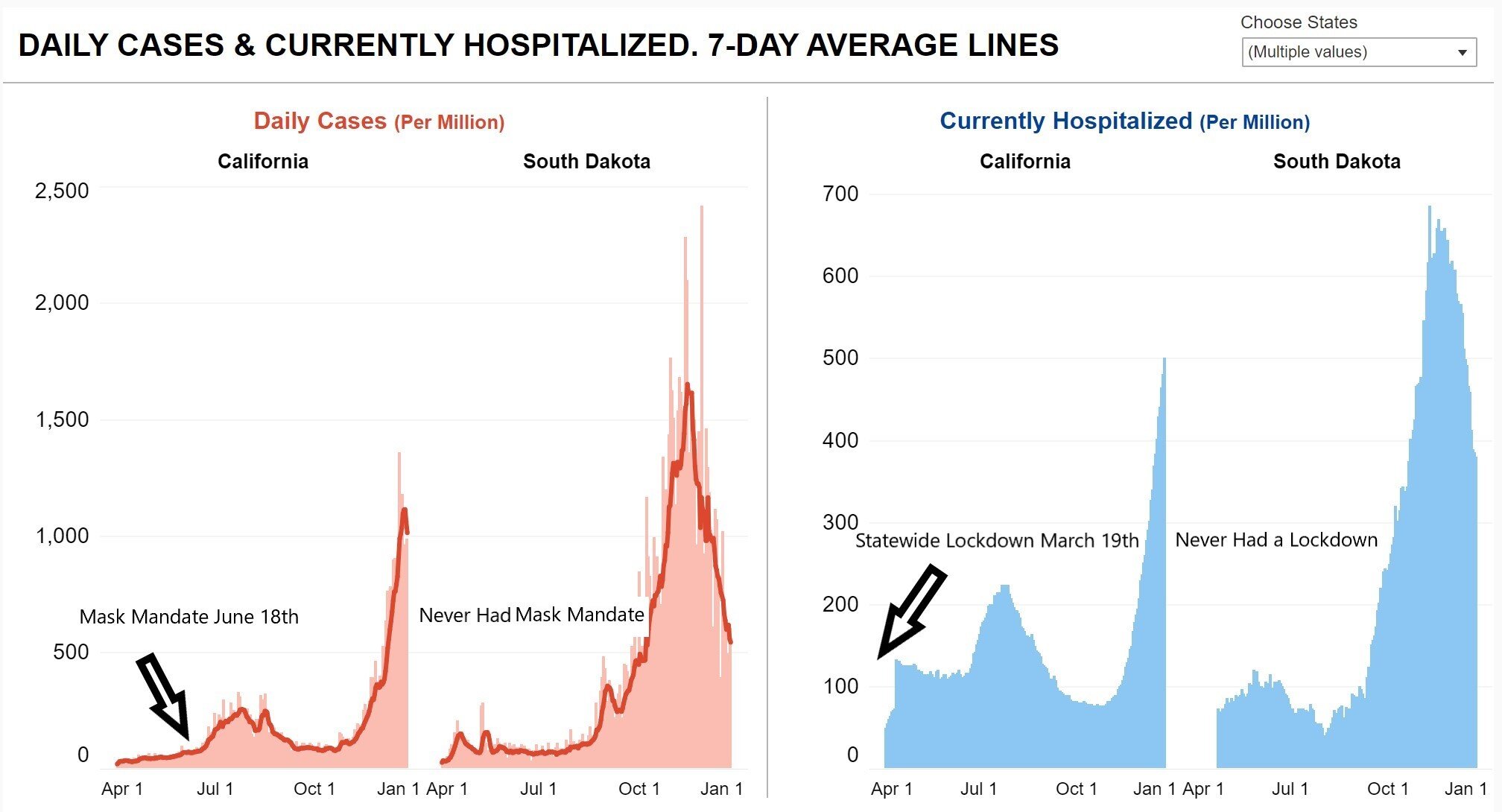
Now let's take a look at California and South Dakota. California started lockdowns on March 19th and mask mandates on June 18th. South Dakota did neither. The graphs below show that they had a similar PATTERN of infection. If the lockdowns and masks worked, these graphs are not evidence.
Check out this piece by CNN blaming the annual motorcycle event in Sturgis, South Dakota, for an upward trend in Minnesota's Covid cases. You can click on the headline to read it.
Take a look at the graphs below and tell me if you can find anything other than the normal viral cycle accounting for both states' upward trends. The arrows indicate the approximate date of the rally. Yet, at the time, the media was quick to blame the rally for the EXPECTED PATTERN OF INFECTION. Upward and downward trends in data are tempting tidbits to hang our scientific hats on, but, as I always say, CORRELATION IS NOT CAUSATION.
Strangely, The flu is not following the predicted pattern this flu season. Look at this chart from the CDC:
This is not close to the expected pattern and should be questioned. Some would say it’s because of all of the precautions already in place, including masks and lockdowns. But Covid-19 is on the rise. I wrote about the scientific consensus that masks don't work for influenza in this post here. They knew it in 1918, but somehow they keep hoping we can magically make them work for the flu and Covid-19 today. Read this article for more on masks and the 1918 flu: Why Gauze Masks 'Failed' in 1918 — And What We Can Do Better. There may be a reasonable explanation regarding flu data right now. It may be that we are only testing for Covid-19 and neglecting the flu. It may be an extraordinarily weak flu season. It could be intentional misinformation to make Covid-19 seem worse. We may never know.
Credit: Vintage Space/Alamy
What we do know is that healthier people are less at risk for the flu and coronavirus infections and their complications. A healthy immune system is one of the best defenses against Covid-19. I am not advising you to stop wearing your mask if you are comfortable doing so, or the law says you should. I am only reporting the facts as they stand.
Here's what you can do right now to improve your immune system:
Get enough sleep
Eat a nutrient-dense diet devoid of processed carbohydrates and seed oils
Avoid sedentarism
Surround yourself with friends and family (Covid-compliant, of course)
Get some sunshine
Make sure your vitamin D level is OK
Exercise
Minimize stress
Get lots of fresh air


